Case study · Visual product styleguide · 2023–2024
RtoS
An inspection machine with 60+ screens had no unified visual language. I created one — from research through applied demo screens — as the product's first visual standard.
- Role
- UI/UX designer — research, visual standard, screen design
- Team
- Inspection UX (VUX Part)
- Product
- SMT inspection machine (AOI/SPI)
- Output
- OneUX Visual Product Styleguide + demo screens
Context
Creating a visual standard for industrial inspection
The product
An SMT inspection machine checks every solder joint on a circuit board. Operators work across 60+ screens for programming, production monitoring, defect review and result analysis — all through a desktop interface built over two decades.
The gap
The product had never had a visual standard. Each screen was built by a different team at a different time — no shared typography, no shared color rules, no shared spacing. The same button looked three different ways on three screens.
The opportunity
A visual product styleguide would give every team a shared foundation. New screens would start consistent instead of diverging. Existing screens could be brought to a common standard over time.
The approach
Research first, design second. Study the platform, the operators, and what works in industrial HMI. Then create an original visual standard — not a framework port — and prove it with full-fidelity demo screens.
Summary
Three deliverables
Design research
Studied the existing product, platforms, HMI references and award-winning industrial cases to ground every decision.
60+screens studied 02Visual standard
An original design language covering 6 design elements: layout, typography, color, icons, spacing and contrast.
6design elements, one visual language 03Demo screens
Full-fidelity screens that proved the standard works at real production density.
3key screens designed end-to-endResearch: understand before designing
The product runs on Windows, the operators already know Windows, and the screens are information-dense. The research shaped what kind of visual language this product actually needs.
No documented design rationale. Each screen team made its own visual choices with no shared reference.
A design research document grounding every decision — from typeface to color philosophy — in the product's actual context.
Inspection job cycle — 5 main steps
Access files
Open or create an inspection job.
Pre-settings
Configure board, fiducial, barcode and compensation.
Machine analyze
The machine scans and measures every joint.
Review & check
Operator reviews flagged defects and verifies results.
Update settings
Tune thresholds based on inspection results.
Platform, not a framework
Studied WinUI, Material, Adobe tools and others as references — but adopted none. As stated in the research: “We cannot follow a framework, this is used for reference only.”
HMI references
Studied iF and Red Dot HMI award winners, the High Performance HMI Handbook, factory reports and existing inspection software (AOI, KSmart, Neptune, SPI) to understand the domain's visual expectations.
Two operator scenarios
Standing in front of screens — close enough to set parameters. And leaving temporarily — monitoring from a distance. Each scenario demands different visual emphasis in the same interface.
An original visual standard
Not a framework port. Every rule was designed for this product's density, multi-language support and operator context. The research defined 6 design elements: Layout, Font/Typeface, Color, Icons, Spacing and Contrast.
Mixed fonts, ad-hoc sizes, arbitrary colors. CJK and Arabic text broke layouts regularly.
Noto Sans for all scripts. 8 type levels. Warm/cool/neutral color groups. 4px spacing grid. Modular layout zones at 1920×1080.
Warm
Something wrong, need to check and resolve.
#a40b0b#FF0000#ff5b68#f69945#FFE200Cool
Everything still running normal/good without actions.
#62C181#57b8ff#336ED0Neutral
Information, labels, surfaces. Not warm/cool status colors.
#272838#f4f6f8#AFB1BCFrom the Figma source: “This is not official colors code using in actual design.” Colors and their exact codes were working values, marked as subject to change after screen design was completed.
Why warm/cool/neutral?
Using neutral colors for most items helps avoid overloading cognitive colors, and makes status colors stand out. Other colors should not be similar to status colors to avoid conflict and mistaken perception.
Priority system
Suggested priority warning: P1 (highest) Red, P2 Yellow, P3 Orange. Warm colors display well and catch the eye even at low density compared with neutral elements.
Depth 1 / 2 / 3
The neutral palette includes three depth levels for layered surfaces — creating visual hierarchy between panels, cards and content areas without relying on color.
4px grid
Every spacing value is a multiple of 4. The Figma notes: “Depending on specific cases, this rule could be flexibly used without consistent to achieve the highest visual effectiveness.”
Noto Sans, all scripts
One typeface family covers Latin, Chinese, Japanese, Korean and Arabic — 9 weight variables from Extra Thin to Black. Layout doesn't break when the machine is deployed in a different market.
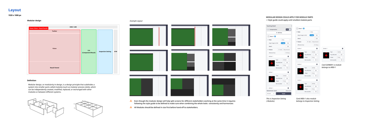
Modular zones
The screen is divided into independently designable zones at 1920×1080. The style guide applies down to the smallest module part: a card inside a panel inside a zone follows the same rules.
Contrast
WCAG 2.1 AA baseline
The contrast should follow WCAG 2.1 standards at least level AA. Checking with the WebAIM contrast checker.
Pragmatic exception
The standard doesn’t require apply for all elements. A white button on a light blue background doesn’t meet WCAG, but users still easily recognise it based on size of button and stroke that increases the differentiating factor.
Icons
Three main icon sizes. Using monotone colors helps avoid conflict with other status colors. Icon style based on the previous product design.
Demo screens: proving the standard works
A styleguide only works if it survives contact with real screen density. I designed the product's key screens end-to-end to prove the visual language holds at production complexity.
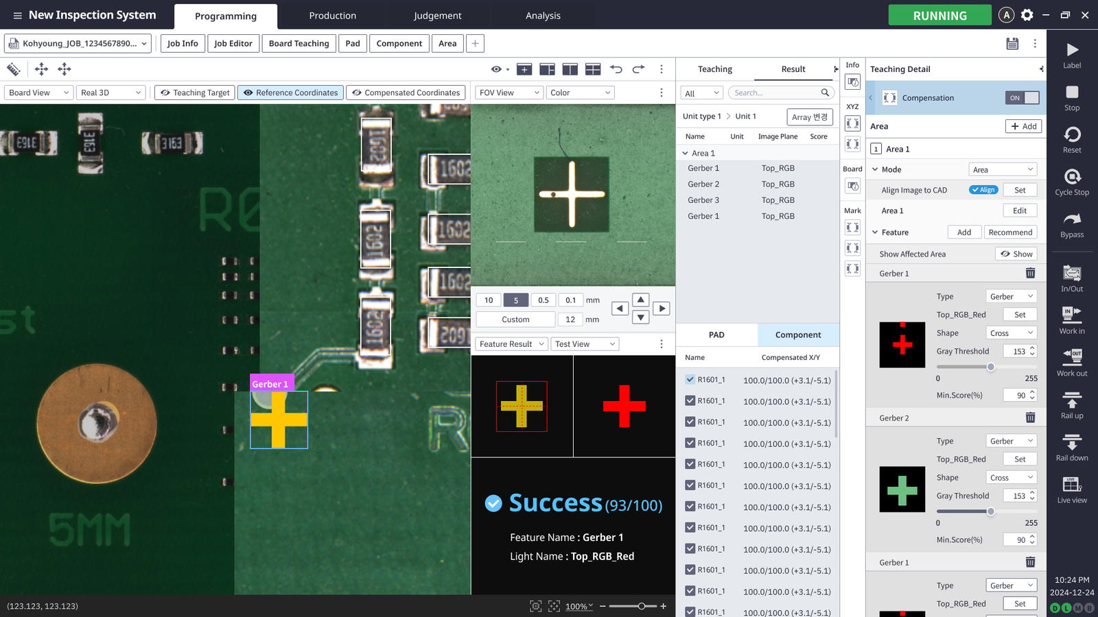
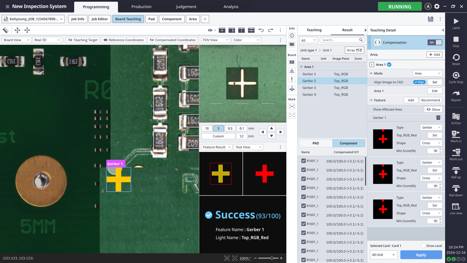
Machine status colors as applied in the demo screens
Production density
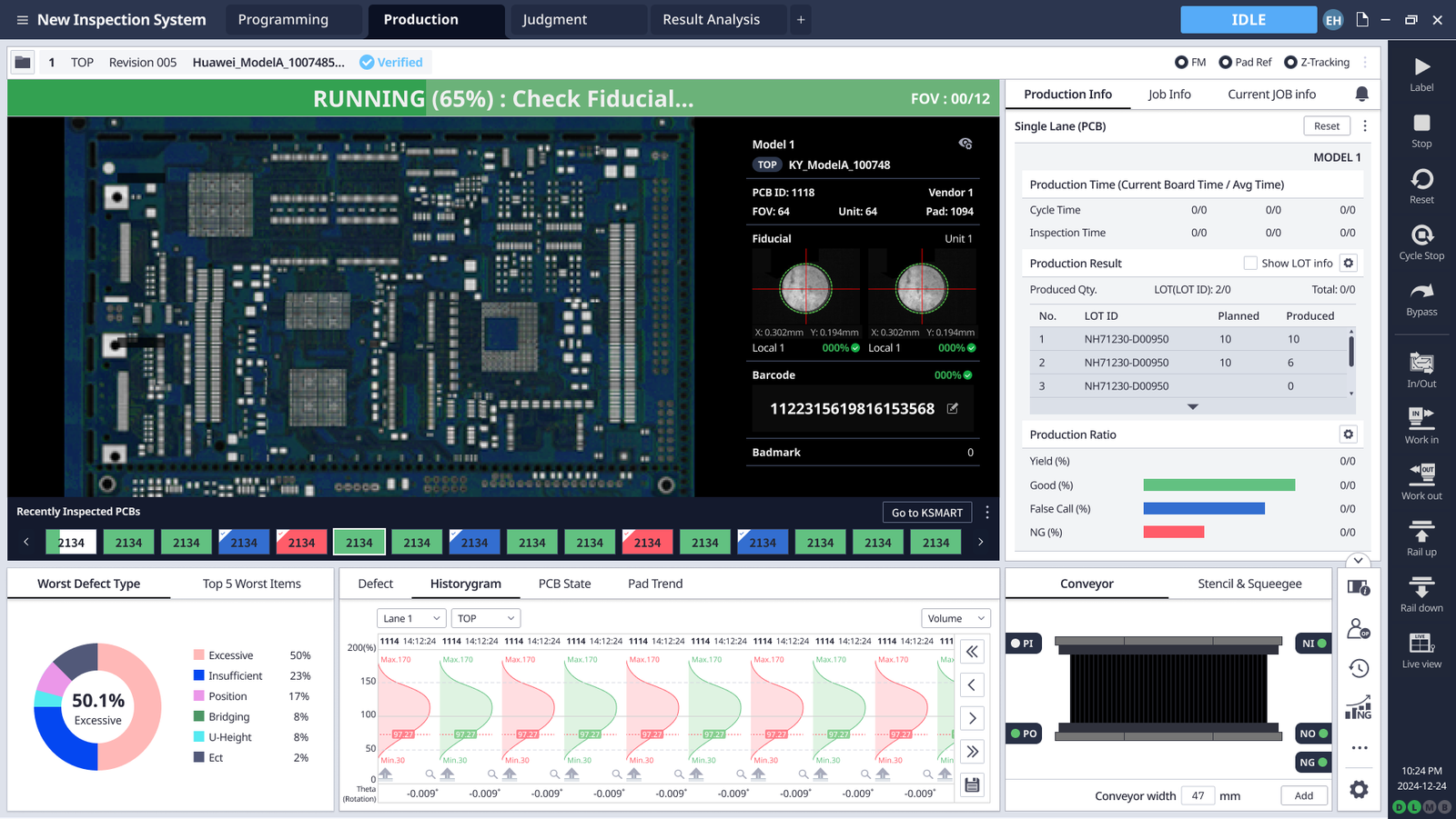
The production screen packs board view, fiducial status, barcode, LOT tracking, yield ratios, defect histogram and conveyor control into one 1920×1080 view. Every element follows the styleguide.
Programming depth
The programming screen nests three levels deep: Area → Gerber Feature → Threshold settings. The modular zone system keeps each level independently scrollable and editable.
Warm/cool/neutral in practice
The RUNNING status bar uses green. NG and red-coded PCB chips in the recently-inspected strip immediately stand out. Neutral surfaces stay out of the way — exactly the cognitive separation the color philosophy intended.
Insights
What I learned and what carried forward.
-
Design the standard, not the screens.
When the standard is strong enough, individual screens compose themselves from it. The time spent on the rules paid back across every demo screen I built afterwards.
3 screens from 1 standard, consistent without checking -
Reference, don't adopt.
We studied WinUI, Material and others — but built our own. As the research states: “We cannot follow a framework, this is used for reference only. It does not serve to apply to our design.”
From the Design Insights document -
Neutral keeps status visible.
Using neutral colors for most items avoids overloading cognitive colors and makes status stand out. The separation into warm, cool and neutral wasn’t aesthetic preference — it was a way to keep alerts unambiguous on dense screens.
Warm/cool/neutral: function-driven, not decorative -
A styleguide proves itself by surviving real density.
The demo screens were the test. If the visual language couldn't handle the product's densest screens — programming with 3 nesting levels, production with multiple data zones — the standard wasn't ready.
Production and programming density validated the foundation
My part
What I designed and delivered.
Design research
Studied 60+ existing screens. Referenced WinUI, Material, Adobe tools, iF/Red Dot HMI awards, the HMI Handbook, factory reports and related inspection software. Defined 2 operator scenarios and a 5-step workflow.
Visual product styleguide
Authored the OneUX standard: Noto Sans type scale (8 levels), warm/cool/neutral color groups, 4px spacing grid, modular layout zones, 3 icon sizes, WCAG AA contrast baseline with pragmatic exceptions.
Demo screens
Designed Production, Programming/Teaching and Board Teaching screens end-to-end in full fidelity at 1920×1080, validating the standard at real density.
Design elements
Defined 6 design elements: Layout, Font/Typeface, Color, Icons, Spacing and Contrast — each documented with rationale, examples and working values in the Figma source.
Twin-V →